


Jetpack Compose is Android’s recommended toolkit for building native UIs, making UI development on Android faster and easier. With fewer lines of code, powerful tools, and intuitive Kotlin APIs, you can bring your app to life quickly. It comes with a variety of ready-made view components to choose from.
Even though Compose offers many built-in layouts, there might be times when you need a custom layout to meet specific requirements. Creating custom layouts can be challenging, involving arranging components, precise positioning, and sizing on the screen. That’s where Jetpack Compose shines—it provides powerful APIs that make designing custom layouts a breeze.
Getting Started
Before getting started, make sure you have knowledge about basic layouts of composable and how they work. Check out the documentation about Compose Basic Layouts .
What are Custom Layouts
Custom layouts are the layouts where you can position and arrange components in your own way other than the layouts provided by Jetpack Compose like Row, Column, Box etc. This can be particularly useful to design complex and unconventional UI.
Anatomy of a Custom Layout
A custom layout can be built by using the Layout composable. This composable allows to measure and place the contents manually. All the higher level layouts use this composable.
Layout composable takes three parameters. First one is the content (the children composable(s)) to be laid out. Second one is the modifier that is to be applied to the layout. It is beyond the scope of this blog, but details can be found
here
. The third and the most important is the measurePolicy which is responsible for how and where the content or provided composables will be laid out.
So the skeleton of a custom layout will be something like this.
@Composable
fun MyCustomLayout(
    modifier: Modifier = Modifier,
    content: @Composable () -> Unit
) {
    Layout(
        modifier = modifier,
        content = content,
        measurePolicy = { measurables, constraints ->
            // measure and position children given constraints logic goes here
            // ...
        }
    )
}
Here, the measurables we get in the lambda are what we pass as content when using the custom layout. Each Measurable in measurables list is a child of content. Any number of Measurable can be passed as content.
MeasurePolicy
MeasurePolicy defines the measurement and layout behavior of a Layout. Layout and MeasurePolicy are the way Compose layouts (such as Box, Column, etc.) are built, and they can also be used to achieve custom layouts.
Measurepolicy is basically an interface and for the actual measurement of the composable we only need to override the MeasurePolicy.measure method. There are other methods which takes intrinsic measurement of composables in consideration, but for most of the cases we may not need them.
fun interface MeasurePolicy {
    fun MeasureScope.measure(
        measurables: List<Measurable>,
        constraints: Constraints
    ): MeasureResult
}
From the definition of the measure method, we can see that it takes a list of Measurable which is a representation of children Composables and Constraints which is the limitation of the size which all child should respect. The function returns a MeasureResult which holds the size and alignment lines of the measured layout as well as the children positioning logic. Since MeasureResult contains the overall size of the layout and the order and children’s positioning logic, it will not be difficult to place the children in right place and in right size.
Measurable and Placeable
In light of MeasurePolicy, two important terminologies called Measurable and Placeable should be described. Measurable is a part of composable that can be measured. It gives the information about how much space it may take to render itself, but not how it should be constrained. So, a Measurable cannot be placed without measuring it against the contraints of the layout. Measuring a Measurable against the layout constraints gives a Placeable which can be placed within the boundary of a layout. Placeable has its size as well as constraints, making it possible to determine the overall size of the layout. Since, single-pass measurement is used by compose for efficient performace, each Measurable can be measured only once inside a layout pass.
Layouting Phases
The MeasureResult is obtained in three phases. These phases are mandatory for a successful layouting.
- Measure the size of children
- Decide its own (the layout itself) size
- Place the children within the boundary of the layout
Example with Explanation
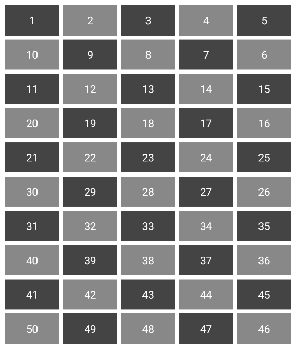
We will create a custom vertical grid layout that alternates its traversal direction. Initially, it will traverse from left to right (LtR), and then switch to right to left (RtL), repeating this alternating pattern. Something similar to the following.
| 1 | 2 | 3 | 4 | 5 |
| 10 | 9 | 8 | 7 | 6 |
| 11 | 12 | 13 | 14 | 15 |
| 20 | 19 | 18 | 17 | 16 |
| 21 | 22 | 23 | 24 | 25 |
Measure the Size of Children
As it is said earlier, for a successful layout, we must go through three steps. In the first step we will measure the size of each child.
@Composable
fun AlteringVerticalGrid(
    modifier: Modifier = Modifier,
    column: Int = 2,
    content: @Composable () -> Unit
) {
    Layout(
        modifier = modifier,
        content = content
    ) { measurables, constraints ->
        val itemWidth = constraints.maxWidth / column
        val itemConstraints = constraints.copy(
            minWidth = itemWidth,
            maxWidth = itemWidth
        )
        val placeables = measurables.map { measurable ->
            measurable.measure(itemConstraints)
        }
        // Decide layout size and place children logic goes here
    }
}
Here, we have divided the maximum width of the layout into equal part of number of column. So, each column has a width of itemWidth. We want to make sure that each item has equal width. So, we constrain their width to be equal to the column width.
Decide Own Size
In the context of a vertical grid layout, where the width remains fixed, but the height is variable, our approach will be to utilize the maximum available width. Regarding the height dimension, we will calculate the height of each row and accumulate the total heights of all rows. Specifically, each row’s height will be determined by the maximum height of any cell within that particular row.
Let’s jump to the code.
val width = constraints.maxWidth

val gridHeights = mutableMapOf<Int, Int>()
placeables.forEachIndexed { index, placeable ->
    val currentGrid = index / column
    val currentGridHeight = gridHeights[currentGrid] ?: 0
    if (placeable.height >= currentGridHeight) gridHeights[currentGrid] = placeable.height
}
val height = gridHeights.values.sumOf { it }
Place the Children within the Boundary of the Layout
Now that we have both the children and layout height, we can proceed to position the children. This is where it gets interesting – we have the flexibility to arrange them in different ways, depending on our needs.
Since we’re implementing an alternating vertical layout grid, here’s how we’ll position the items:
- For odd rows, we’ll arrange composables from the beginning of the x-axis while increasing the x-axis value and keeping the y-axis constant.
- For even rows, we’ll position composables from the end of the x-axis, decreasing the x-axis value while keeping the y-axis constant.
- When we move to the next row, we’ll increment the y-axis value.
This approach allows us to create an alternating visual pattern within our vertical grid layout.
Here is the code snippet.
layout(width, height) {
    var x = 0
    var y = 0
    var row = 1
    placeables.forEachIndexed { index, placeable ->
        placeable.placeRelative(x = x, y = y)
        val lastCellOfColumn = index % column == (column - 1)
        if (!lastCellOfColumn) {
            if (row % 2 == 1) x += itemWidth else x -= itemWidth
        } else {
            x = if (row % 2 == 1) x else 0
            y += gridHeights[index / column] ?: 0
            row++
        }
    }
}
Improvement: Add Some Spacing between Items
So far in the implementation, the items are placed closely together without any spacing, either horizontally or vertically. Now, let’s introduce some spacing around the items.
To add horizontal spacing, we need to adjust the size of each item to accommodate the total available width after accounting for the horizontal space required between two adjacent items. Here’s the calculation:
val horizontalSpacingPx = horizontalSpacing.roundToPx()
val totalHorizontalSpace = (column - 1) * horizontalSpacingPx
val itemWidth = (constraints.maxWidth - totalHorizontalSpace) / column
The value for horizontalSpacing will be provided as a parameter.
For vertical spacing, we should increase the total height of the layout by the amount of vertical space needed.
val verticalSpacingPx = verticalSpacing.roundToPx()
val totalVerticalSpace = (gridHeights.size - 1) * verticalSpacingPx
val height = gridHeights.values.sumOf { it } + totalVerticalSpace
Similarly, the value for verticalSpacing will also be provided as a parameter.
When placing each item, we will follow the same logic as before, but we’ll increase the x-axis position while considering the horizontal spacing and the y-axis position while considering the vertical spacing. The modified version would look like this:
layout(width, height) {
    var x = 0
    var y = 0
    var row = 1
    val itemWidthWithHorizontalSpacing = itemWidth + horizontalSpacingPx
    placeables.forEachIndexed { index, placeable ->
        placeable.placeRelative(x = x, y = y)
        val lastCellOfColumn = index % column == (column - 1)
        if (!lastCellOfColumn) {
            if (row % 2 == 1) x += itemWidthWithHorizontalSpacing else x -= itemWidthWithHorizontalSpacing
        } else {
            x = if (row % 2 == 1) (width - itemWidth)  else 0
            y += (gridHeights[index / column] ?: 0) + verticalSpacingPx
            row++
        }
    }
}
Full Code
@Composable
fun AlteringVerticalGrid(
    modifier: Modifier = Modifier,
    column: Int = 2,
    horizontalSpacing: Dp = 0.dp,
    verticalSpacing: Dp = 0.dp,
    content: @Composable () -> Unit
) {
    Layout(
        modifier = modifier,
        content = content
    ) { measurables, constraints ->
        val horizontalSpacingPx = horizontalSpacing.roundToPx()
        val totalHorizontalSpace = (column - 1) * horizontalSpacingPx
        val itemWidth = (constraints.maxWidth - totalHorizontalSpace) / column
        val itemConstraints = constraints.copy(
            minWidth = itemWidth,
            maxWidth = itemWidth
        )
        val placeables = measurables.map { it.measure(itemConstraints) }
        val width = constraints.maxWidth
        val gridHeights = mutableMapOf<Int, Int>()

        placeables.forEachIndexed { index, placeable ->
            val currentGrid = index / column
            val currentGridHeight = gridHeights[currentGrid] ?: 0
            if (placeable.height >= currentGridHeight) gridHeights[currentGrid] = placeable.height
        }

        val verticalSpacingPx = verticalSpacing.roundToPx()
        val totalVerticalSpace = (gridHeights.size - 1) * verticalSpacingPx
        val height = gridHeights.values.sumOf { it } + totalVerticalSpace

        layout(width, height) {
            var x = 0
            var y = 0
            var row = 1
            val itemWidthWithHorizontalSpacing = itemWidth + horizontalSpacingPx
            placeables.forEachIndexed { index, placeable ->
                placeable.placeRelative(x = x, y = y)
                val lastCellOfColumn = index % column == (column - 1)
                if (!lastCellOfColumn) {
                    if (row % 2 == 1) x += itemWidthWithHorizontalSpacing else x -= itemWidthWithHorizontalSpacing
                } else {
                    x = if (row % 2 == 1) x else 0
                    y += (gridHeights[index / column] ?: 0) + verticalSpacingPx
                    row++
                }
            }
        }
    }
}
Usage
AlteringVerticalGrid can be used as follows.
@Composable
fun MyAlteringVerticalGrid() {
    AlteringVerticalGrid(
        modifier = Modifier.padding(8.dp),
        column = 5,
        horizontalSpacing = 5.dp,
        verticalSpacing = 5.dp
    ) {
        repeat(25) {
            Box(
                modifier = Modifier
                    .height(40.dp)
                    .background(if (it % 2 == 1) Color.Gray else Color.DarkGray)
            ) {
                Text(
                    text = "${it + 1}",
                    color = White,
                    modifier = Modifier.align(Alignment.Center)
                )
            }
        }
    }
}
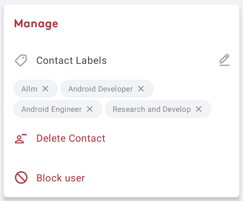
Usage of Custom Layout in Join Application
While the above example is primarily for illustrative purpose, this concept was also implemented in the Join application. This was essential to display contact labels in a way that shifts them to the next row if there’s insufficient space in the current row. Since there wasn’t an existing layout that met this specific requirement at the time, a custom solution was developed.
References
There are lots of resources available to learn about custom layouts. The following references are worth mentioning.


最後まで読んでいただき、ありがとうございます!
この記事をシェアしていただける方はこちらからお願いします。