


Hello, I’m ojun , a 2023 graduate!
DeNA was a Gold Sponsor at try! Swift Tokyo 2024 from Friday, March 22, to Sunday, March 24, 2024. Furthermore, we had a Sponsor Booth where we held the “SwiftUI Preview Challenge”, a project prepared by our iOS app engineers!
The event was a great success, with many participants joining us. Thank you to everyone who participated in the Challenge. Moreover, the number of answer sheets collected for the “SwiftUI Preview Challenge” was 362! Since it was possible to take the answer sheet home, we were able to have even more participants than expected.
In this blog, we will introduce the questions of the “SwiftUI Preview Challenge” and their answers, along with detailed explanations.
Code and Explanation for Question 1
Below is the question and the preview result for Question 1.
import SwiftUI

struct Question1View: View {
    private let helloString = "Hello, try! Swift Tokyo 2024!"

    var body: some View {
        VStack {
            HStack {
                Text(helloString)
                    .layoutPriority(1)

                Spacer()

                Text(helloString)
            }

            Spacer()

            Text(helloString)

            Spacer()

            HStack {
                Text(helloString)

                Spacer()

                Text(helloString)
                    .layoutPriority(1)
            }
        }
        .padding()
    }
}
Preview Result of Question 1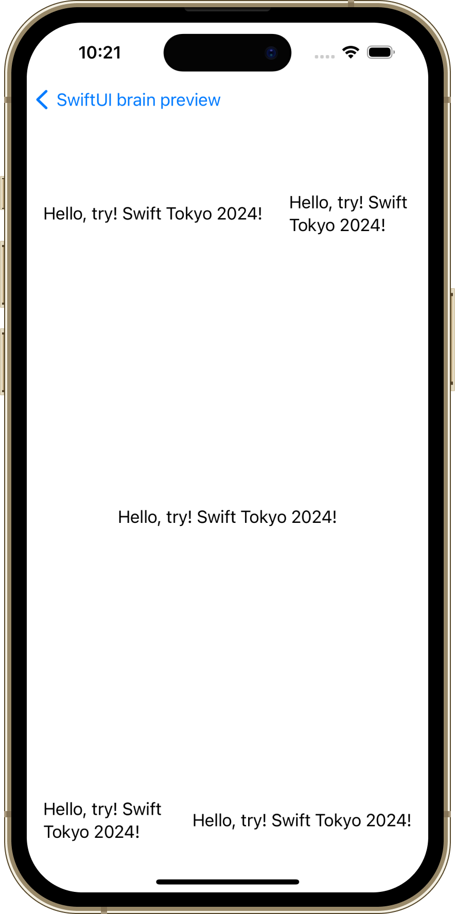
Explanation
This question involves previewing the phrase Hello, try! Swift Tokyo 2024!, positioned at the top right, bottom right, top left, bottom left, and center.
Key Points
The key to answering this question lies in understanding
layoutPriority
.
By utilizing this method and setting a value, you can set the priority with which a parent layout allocates space to its child layouts. The default is 0.
In the question, .layoutPriority(1) is assigned to two Text views, which is greater than the default value of 0, preventing line breaks.
Code and Explanation for Question 2
Below is the question and the preview result for Question 2.
import SwiftUI

struct Question2View: View {
    @State private var isOn = false
    @State private var sliderValue: Double = 75

    var body: some View {
        Form {
            Section("try! Swift Tokyo 2024") {
                Toggle(isOn: $isOn) {
                    Text("Toggle")
                }

                Slider(value: $sliderValue, in: 0...100) {
                    Text("Slider")
                }

                GroupBox("try! Swift") {
                    Text("try! Swift is global tech conference of Swift!")
                }
            }
        }
        .navigationBarTitle("DeNA Booth")
    }
}
Preview Result of Question 2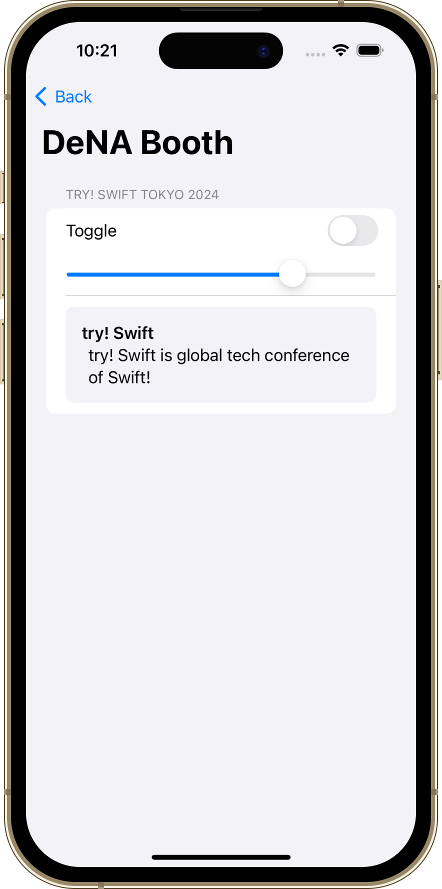
Explanation
This question focuses on previewing standard UI components constructed mainly around Form and Section.
It’s a typical interface seen on many settings screens.
While the initializer for Slider includes a label argument with the value Text("Slider"), the tricky part is that this label is not displayed on the screen.
Key Points
The label in the initializer
init(value:in:label:onEditingChanged:)
for Slider is provided as a view to describe its function or purpose. It’s important to understand that this label is not necessarily displayed on the screen. In fact, the specified label is not shown but is used by accessibility features like VoiceOver.
Code and Explanation for Question 3
Below is the question and the preview result for Question 3.
import SwiftUI

struct Question3View: View {
    var body: some View {
        VStack(spacing: 16) {
            Button("Plain") {}
                .buttonStyle(.plain)

            Button("Bordered") {}
                .buttonStyle(.bordered)

            Button("Bordered Prominent") {}
                .buttonStyle(.borderedProminent)

            Button("Borderless") {}
                .buttonStyle(.borderless)

            Button(action: {}) {
                Label("Search", systemImage: "magnifyingglass")
                    .padding()
                    .background(.blue)
                    .foregroundStyle(.white)
            }
            .cornerRadius(16)
        }
    }
}
Preview Result of Question 3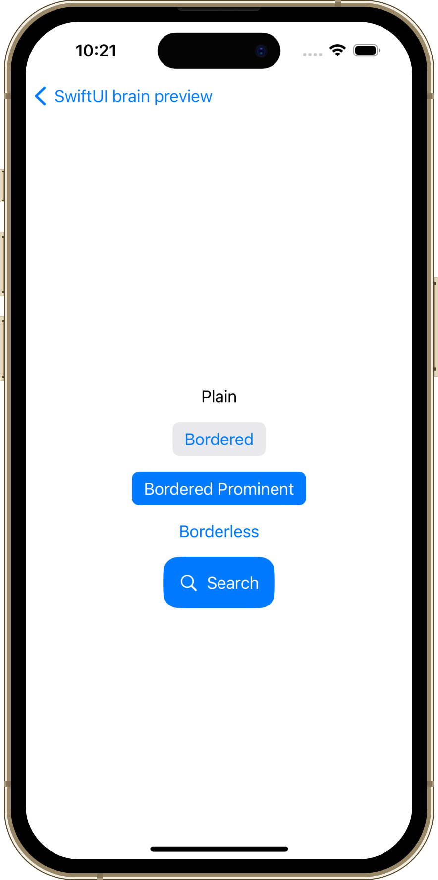
Explanation
This question focuses on how the appearance of a Button changes with different buttonStyle applications. It’s crucial to note that when .buttonStyle(.bordered) is specified, it doesn’t add a border to the button but rather gives it a gray background.
Key Points
.plainremains undecorated while in a waiting state. It becomes highlighted when tapped, but this is almost imperceptible in light mode with a small font size..borderedis a rounded rectangle..borderedProminentis more noticeable than.bordered, as “Prominent” suggests..borderlessis a style without boundaries, commonly used for text links. The default for buttons,.automatic, also defaults to.borderless.
In the following button, the label Label("Search", systemImage: "magnifyingglass") is used. While the code specifies Search first before magnifyingglass, the key to answer this question is to understand that the rendering order will be magnifyingglass followed by Search.
Button(action: {}) {
    Label("Search", systemImage: "magnifyingglass")
        .padding()
        .background(.blue)
        .foregroundStyle(.white)
}
Code and Explanation for Question 4
Below is the question and the preview result for Question 4.
import SwiftUI

struct Question4View: View {
    var body: some View {
        HStack {
            Color.gray
                .frame(width: 100, height: 300)
                .clipShape(RoundedRectangle(cornerRadius: 16))
                .overlay {
                    Text("DeNA")
                        .bold()
                }

            Spacer()

            Ellipse()
                .fill(.gray)
                .frame(width: 200, height: 100)
                .border(.black)
                .overlay {
                    Text("Booth")
                        .bold()
                }
        }
        .padding(.horizontal, 24)
    }
}
Preview Result of Question 4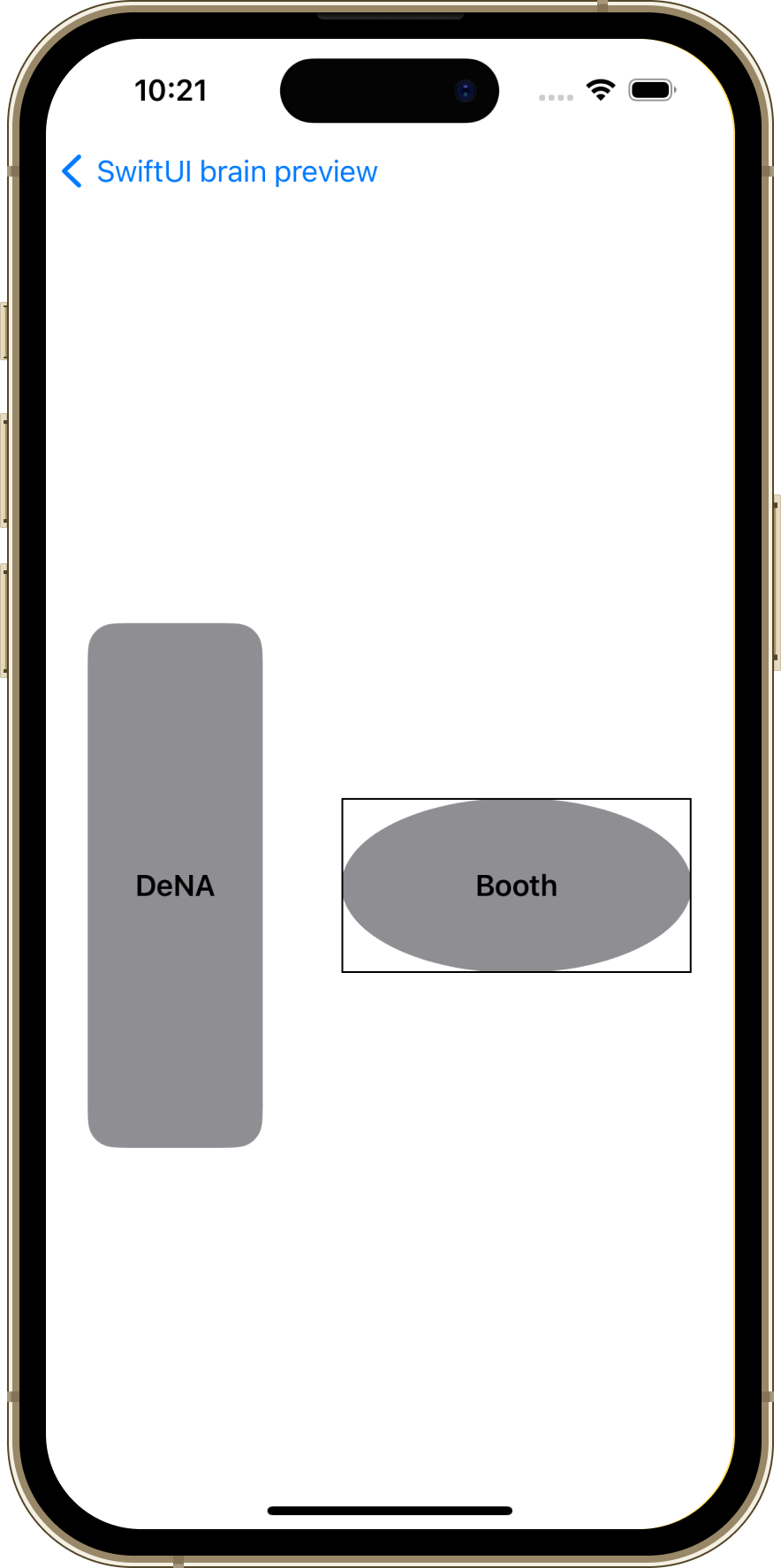
Explanation
This question focuses on the use of Color and the shape Ellipse() for previewing. Spacers are inserted between these components, resulting in the shapes being displayed at equal intervals.
Key Points
The shapes rendered in gray differ between the two; the former is Color.gray applied to a RoundedRectangle (rounded rectangle) and then clipped with clipShape(_:style:), while the latter is an Ellipse (ellipse) filled with Color.gray using fill(_:style:).
Regarding the Color part, the key point is the use of .overlay to display the text “DeNA.” As for the Ellipse(), it’s important to note that .border(.black) is applied. When .border(.black) is applied, the border is drawn around the frame, not around the ellipse itself, resulting in the displayed appearance.
Code and Explanation for Question 5
Below is the question and the preview result for Question 5.
import SwiftUI

struct Question5View: View {
    private let symbols = [
        "swift",         "apple.terminal", "applescript",
        "accessibility", "hare",           "tortoise",
        "opticid",       "skateboard",     "fireworks",
    ]

    private let columns: [GridItem] = [
        .init(.flexible(), spacing: 16),
        .init(.flexible(), spacing: 16),
        .init(.flexible()),
    ]

    var body: some View {
        VStack {
            LazyVGrid(columns: columns, spacing: 16) {
                ForEach(symbols, id: \.self) { symbol in
                    Image(systemName: symbol)
                        .font(.system(size: 48))
                }
            }
        }
        .padding()
    }
Preview Result of Question 5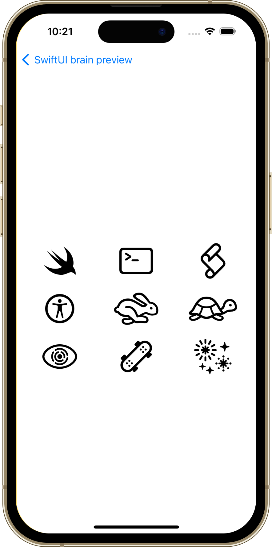
Explanation
This question required the ability to accurately preview nine types of SF Symbols provided by Apple, testing users’ knowledge of and affection for Apple products and SF Symbols.
The symbols for a wild rabbit (hare) and a tortoise (tortoise) are used, for example, in the iOS accessibility settings under the “Speech Rate” options as symbols.
Notably, opticid, skateboard, and fireworks are relatively new symbols introduced in iOS 17, macOS Sonoma, and beyond.
Code and Explanation for Question 6
Below is the question and the preview result for Question 6.
import SwiftUI

struct Question6View: View {
    private let symbols = [
        "chevron.forward", "square.and.arrow.up", "ellipsis",
        "delete.forward",  "book",                "bookmark",
        "video",           "timelapse",           "scribble",
    ]

    private let columns: [GridItem] = [
        .init(.flexible(), spacing: 16),
        .init(.flexible(), spacing: 16),
        .init(.flexible()),
    ]

    var body: some View {
        VStack {
            LazyVGrid(columns: columns, spacing: 16) {
                ForEach(symbols, id: \.self) { symbol in
                    Image(systemName: symbol)
                        .font(.system(size: 48))
                }
            }
        }
        .padding()
    }
}
Preview Result of Question 6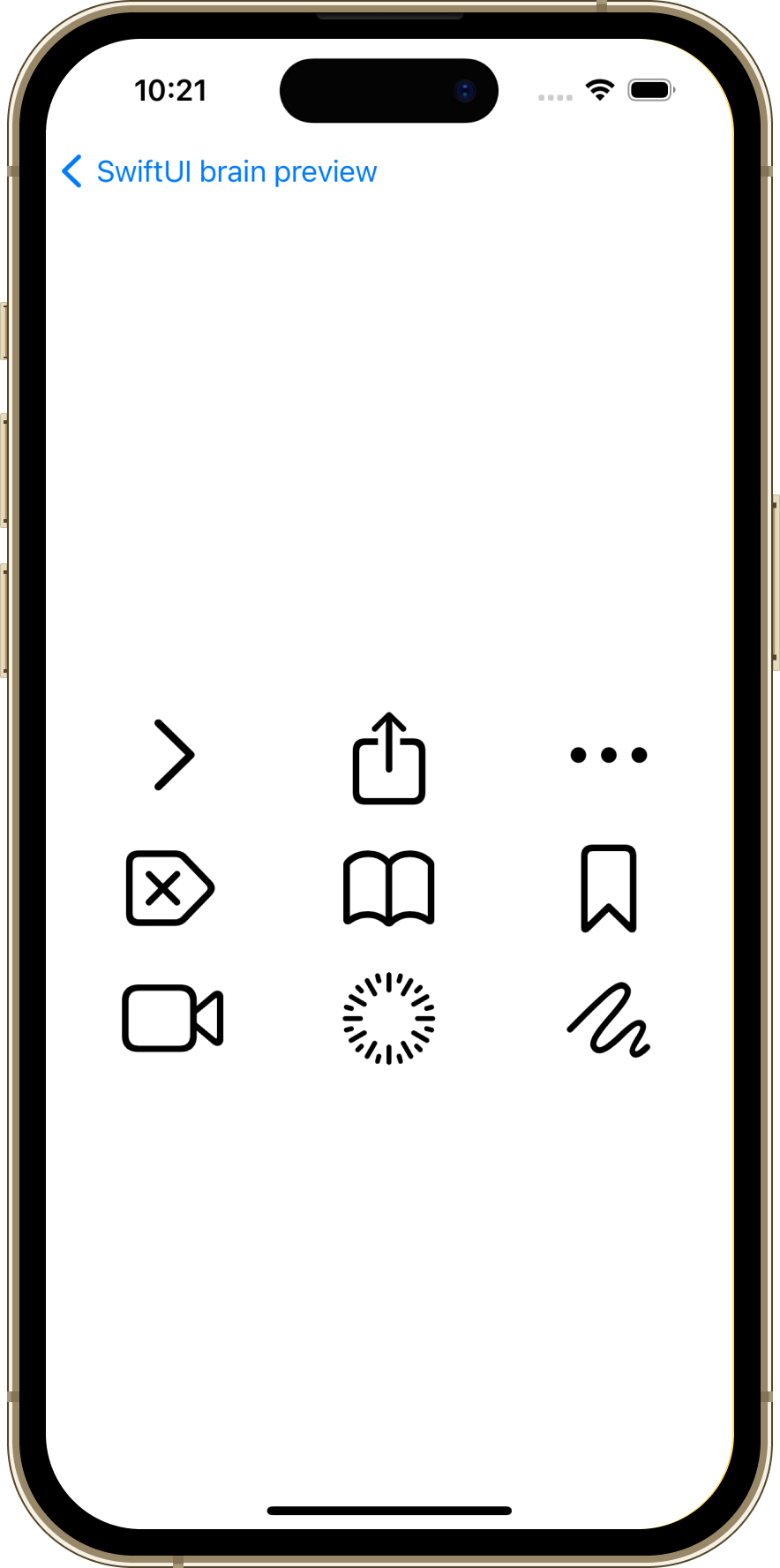
Explanation
This question, like Question5, involves previewing SF Symbols.
The direction of the arrows in chevron.forward and delete.forward varies depending on the device’s language settings. The screenshots provided are from a Japanese environment (ja_JP), where the language is written from left to right, hence the arrows are depicted in this manner.
Code and Explanation for Question 7
Below is the question and the preview result for Question 7.
import SwiftUI

struct Question7View: View {
    private let symbols = [
        "iphone.gen1", "iphone.gen2", "iphone.gen3",
        "macpro.gen1", "macpro.gen2", "macpro.gen3",
    ]

    private let columns: [GridItem] = [
        .init(.flexible(), spacing: 16),
        .init(.flexible(), spacing: 16),
        .init(.flexible()),
    ]

    var body: some View {
        VStack {
            LazyVGrid(columns: columns, spacing: 32) {
                ForEach(symbols, id: \.self) { symbol in
                    Image(systemName: symbol)
                        .font(.system(size: 96))
                }
            }
        }
        .padding()
    }
}
Preview Result of Question 7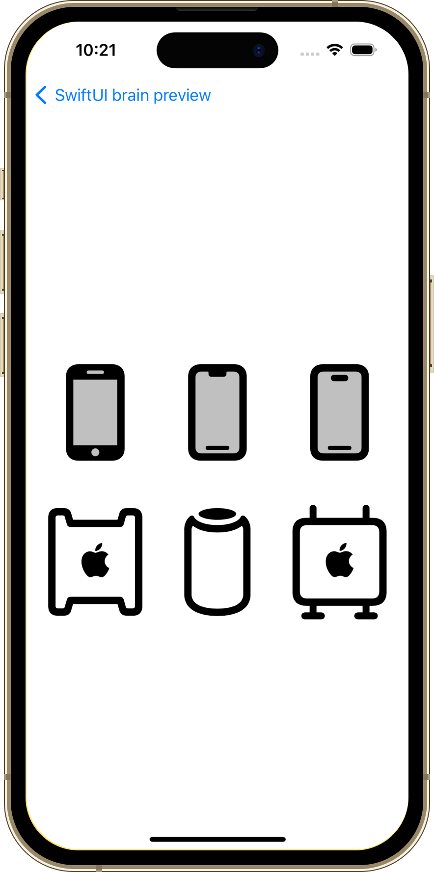
Explanation
Similar to Question5 and Question6, this question involves previewing SF Symbols.
iphone.gen1 refers to an iPhone with a home button, iphone.gen2 refers to an iPhone model with a full-screen display, and iphone.gen3 denotes an iPhone with a full-screen display and equipped with Dynamic Island. Furthermore, macpro.gen1 represents the appearance of models up until 2013, macpro.gen2 is from 2013 to 2019, and macpro.gen3 corresponds to models post-2019.
Code and Explanation for Question 8
Below is the question and the preview result for Question 8.
import SwiftUI

struct Question8View: View {
    private let indexes = [0, 1, 2, 3, 4, 5]

    var body: some View {
        ZStack {
            ForEach(0..<indexes.count, id: \.self) { index in
                RadialItem(
                    text: "\(index)",
                    angle: (2 * .pi / Double(indexes.count)) * Double(index)
                )
            }
        }
    }
}

private struct RadialItem: View {
    let text: String
    let angle: Double

    private let offsetValue: CGFloat = 110

    var body: some View {
        Circle()
            .overlay {
                Text(text)
                    .font(.title)
                    .foregroundStyle(.white)
            }
            .frame(width: 60, height: 60)
            .offset(
                x: cos(CGFloat(angle)) * offsetValue,
                y: -sin(CGFloat(angle)) * offsetValue
            )
    }
}
Preview Result of Question 8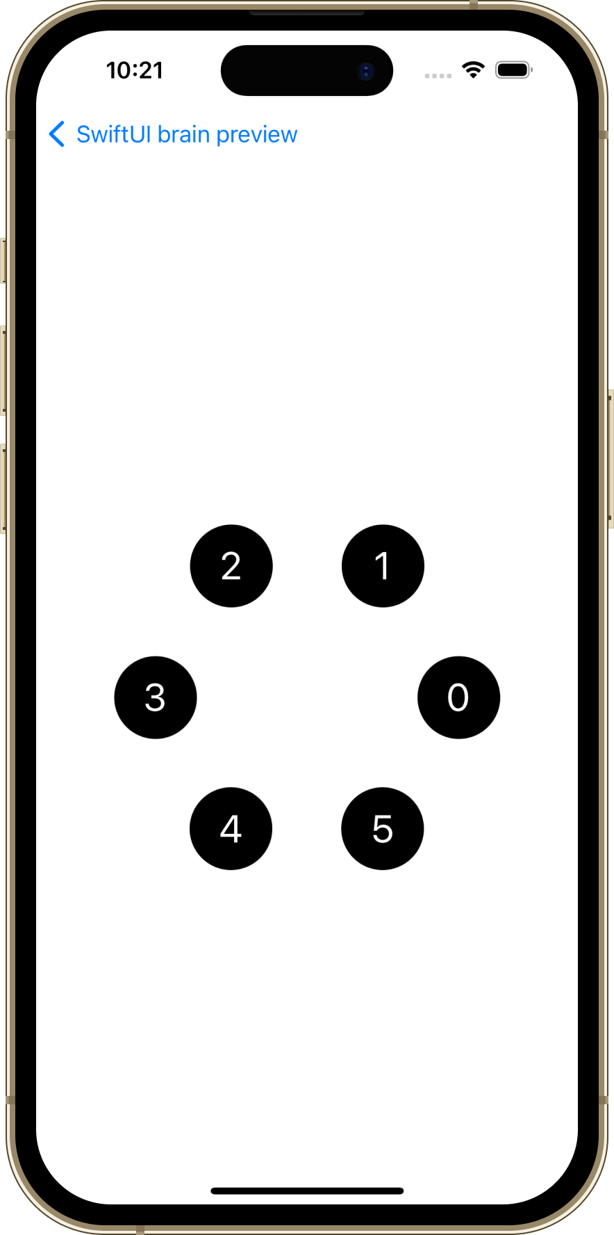
Explanation
This question involves accurately previewing numbers placed on a circular path. It tests your knowledge of high school mathematics regarding the placement and rotation of numbers on the circumference.
Key Points
For offset’s y, -sin(CGFloat(angle)) * offsetValue is given. The fact that - is applied causes the display order to be counterclockwise, which is a key point.
Another key point is that the initial display of 0 starts from the right side of the screen. This alignment is consistent with the positive direction of the X-axis mathematically, and from there, the numbers are displayed counterclockwise, as described above. (In the screenshot’s environment (iOS, SwiftUI, UIKit), the top left of the device screen is the origin.)
Code and Explanation for Question 9
Below is the question and the preview result for Question 9.
import SwiftUI
import Charts

struct Question9View: View {
    private enum BuildConfiguration: String {
        case debug, release
    }

    private struct SourceFileBuildMetrics: Identifiable {
        let id = UUID()
        let moduleName: String
        let compileTime: Double
        let configuration: BuildConfiguration
    }

    private let buildMetrics: [SourceFileBuildMetrics] = [
        .init(moduleName: "Core", compileTime: 0.1, configuration: .debug),
        .init(moduleName: "Data", compileTime: 0.2, configuration: .debug),
        .init(moduleName: "Core", compileTime: 0.3, configuration: .release),
        .init(moduleName: "Data", compileTime: 0.4, configuration: .release),
    ]

    var body: some View {
        Chart(buildMetrics) { metric in
            BarMark(
                x: .value("Name", metric.moduleName),
                y: .value("Time", metric.compileTime)
            )
            .position(
                by: .value(
                    "Configuration",
                    metric.configuration.rawValue
                )
            )
        }
        .padding(32)
    }
}
Preview Result of Question 9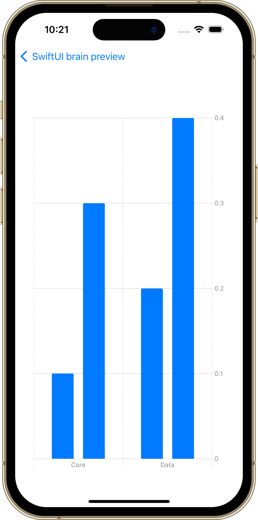
Explanation
From the code, you can deduce the following information:
- The
Coremodule takes0.1sin adebugbuild. - The
Datamodule takes0.2sin adebugbuild. - The
Coremodule takes0.3sin areleasebuild. - The
Datamodule takes0.4sin areleasebuild.
The Chart view represents the compile times for each module as a bar graph, utilizing these metrics. The bar graph’s X-axis represents the module names, and the Y-axis denotes the compile times, with the .position modifier used to group data based on the build configurations.
Key Points
- The
SourceFileBuildMetricsstructure represents the build metrics for each source file. - The
buildMetricsarray holds the compile times for different modules and build configurations. - The
Chartview is used to display the compile times on a bar graph based on the module names. - The
.positionmodifier allows data to be grouped based on build configurations (debug, release).
Code and Explanation for Question 10
Below is the question and the preview result for Question 10.
import SwiftUI
import Charts

struct Question10View: View {
    @State private var selectedHourIndex = 6
    private let postModels: [WeatherInfo] = [
        WeatherInfo(date: Date(year: 2024, month: 3, day: 22, hour: 0)!, temperature: 6, humidity: 60),
        WeatherInfo(date: Date(year: 2024, month: 3, day: 22, hour: 3)!, temperature: 12, humidity: 50),
        WeatherInfo(date: Date(year: 2024, month: 3, day: 22, hour: 6)!, temperature: 18, humidity: 40),
        WeatherInfo(date: Date(year: 2024, month: 3, day: 22, hour: 9)!, temperature: 24, humidity: 30),
        WeatherInfo(date: Date(year: 2024, month: 3, day: 22, hour: 12)!, temperature: 30, humidity: 20),
        WeatherInfo(date: Date(year: 2024, month: 3, day: 22, hour: 15)!, temperature: 36, humidity: 10),
        WeatherInfo(date: Date(year: 2024, month: 3, day: 22, hour: 18)!, temperature: 30, humidity: 20),
        WeatherInfo(date: Date(year: 2024, month: 3, day: 22, hour: 21)!, temperature: 24, humidity: 30),
        WeatherInfo(date: Date(year: 2024, month: 3, day: 22, hour: 24)!, temperature: 10, humidity: 40),
    ]
    private var selectedDate: Date? {
        if postModels.isEmpty { return nil }
        return postModels[min(selectedHourIndex, postModels.count - 1)].date
    }
    private var dataList: [GraphDataModel] {
        postModels.map({ GraphDataModel(type: .humidity, xValue: $0.date, yValue: $0.humidity) })
        + postModels.map({ GraphDataModel(type: .temperature, xValue: $0.date, yValue: $0.temperature) })
    }

    var body: some View {
        Chart(dataList) { data in
            LineMark(
                x: .value("hour", data.xValue, unit: .hour),
                y: .value("value", data.yValue)
            )
            .foregroundStyle(by: .value("Data Type", data.type.rawValue))
            .interpolationMethod(.cardinal)

            if let selectedDate {
                RuleMark(x: .value("Selected date", selectedDate, unit: .hour))
                    .foregroundStyle(Color.red)
            }
        }
        .chartXAxis {
            AxisMarks(values: .stride(by: .hour, count: 3, roundLowerBound: false)) {
                AxisGridLine()
                AxisValueLabel(format: .dateTime.hour(), anchor: .top)
            }
        }
        .chartYAxis {
            let temperatureValues = [10, 20, 30, 40, 50]
            AxisMarks(
                position: .leading,
                values: temperatureValues
            ) {
                AxisGridLine()
                AxisValueLabel("\(temperatureValues[$0.index])℃")
            }

            let humidityValues = [10, 20, 30, 40, 50, 60]
            AxisMarks(
                format: .percent,
                position: .trailing,
                values: humidityValues,
                stroke: .init(dash: [8, 2])
            )
        }
        .frame(height: 300)
        .padding()
    }
}

// MARK: - Privates

private struct WeatherInfo: Identifiable {
    let id = UUID().uuidString
    let date: Date
    let temperature: Int
    let humidity: Int
}

private enum WeatherDataType: String {
    case humidity
    case temperature
}

private struct GraphDataModel: Identifiable {
    var id: String { type.rawValue + xValue.description + yValue.description }
    let type: WeatherDataType
    let xValue: Date
    let yValue: Int
}

private extension Date {
    init?(year: Int, month: Int, day: Int, hour: Int = 0, minute: Int = 0, second: Int = 0, calendar: Calendar = Calendar.current, timeZone: TimeZone = TimeZone.current) {
        var dateComponents = DateComponents()
        dateComponents.year = year
        dateComponents.month = month
        dateComponents.day = day
        dateComponents.hour = hour
        dateComponents.minute = minute
        dateComponents.second = second
        dateComponents.timeZone = timeZone

        if let date = calendar.date(from: dateComponents) {
            self = date
        } else {
            return nil
        }
    }
}
Preview Result of Question 10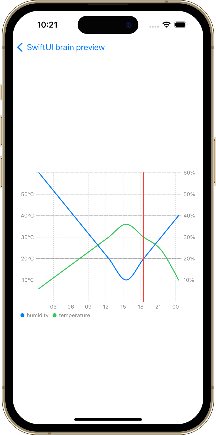
Explanation
This question involves using SwiftUI and the Charts framework to display hourly temperatures and humidity levels on a specific day as a line chart. The WeatherInfo structure contains weather information for each time point, plotted on the graph via GraphDataModel.
LineMarkis used to display the data for temperature and humidity as a line chart. The data is color-coded based on the data type (temperature or humidity) usingforegroundStyle, andinterpolationMethod(.cardinal)is applied to smooth the lines of the graph.- The X-axis (time) is set using
chartXAxis, and tick marks are placed every three hours usingAxisMarks. - There are two scales set for the Y-axis: one for temperature on the left and one for humidity on the right. These are defined using
AxisMarks, placing values on different Y-axes. RuleMarkis used to draw a marker line parallel to the Y-axis at the selected time (based onselectedHourIndexhere).
Key Points
WeatherInfoandGraphDataModelstructure and transform the weather data into a format suitable for graph plotting.LineMarkis used to display temperature and humidity data on a line chart, with color coding based on data type usingforegroundStyle.- Understanding how to customize the X and Y axes, especially representing two different scales (temperature and humidity) on the Y-axis, is crucial.
RuleMarkis used to highlight a specific point in time on the graph, marking the selected time.
Code and Explanation for Question 11
Below is the question and the preview result for Question 11.
import SwiftUI

struct Question11View: View {
    var body: some View {
        Text("ToolBar")
            .toolbar {
                ToolbarItemGroup(placement: .navigation) {
                    Text("A")
                }
                ToolbarItemGroup(placement: .bottomBar) {
                    Text("B")
                    Text("C")
                    Text("D")
                }
                ToolbarItem(placement: .confirmationAction) {
                    Text("E")
                    Text("F")
                }
                ToolbarItem(placement: .destructiveAction) {
                    Text("G")
                    Text("H")
                }
                ToolbarItem(placement: .primaryAction) {
                    Text("I")
                    Text("J")
                }
                ToolbarItem(placement: .principal) {
                    Text("K")
                    Text("L")
                }
                ToolbarItem(placement: .status) {
                    Text("M")
                }
                ToolbarItem(placement: .secondaryAction) {
                    Text("N")
                }
                ToolbarItem(placement: .cancellationAction) {
                    Text("O")
                }
            }
    }
}
Preview Result of Question 11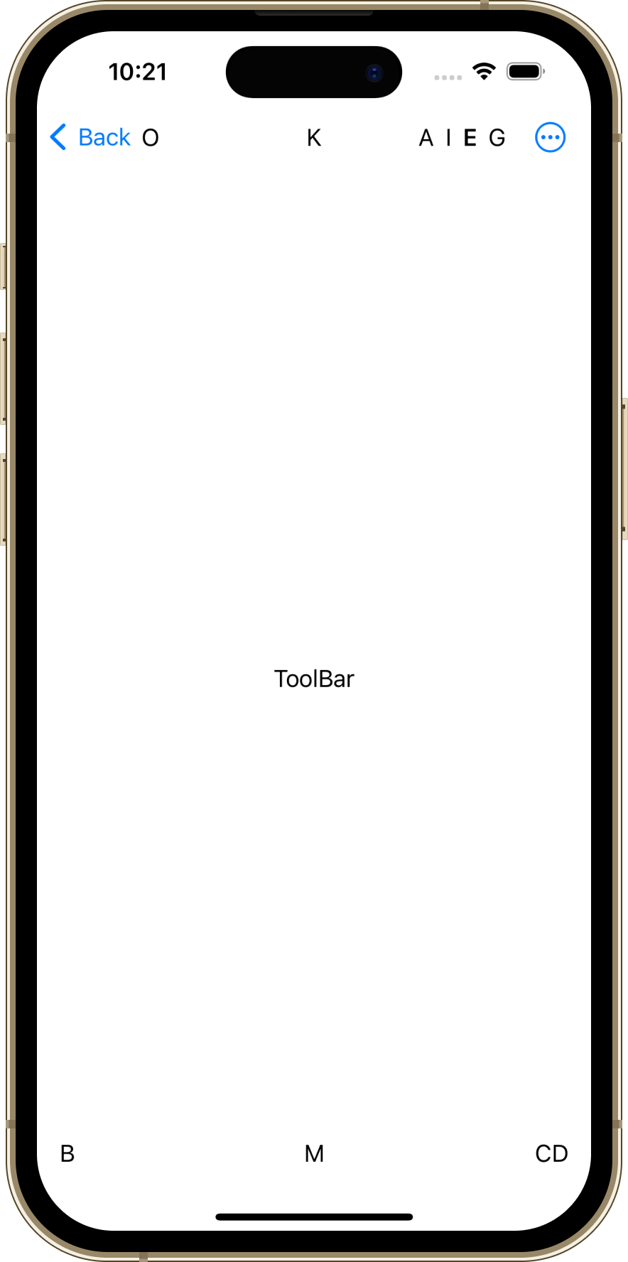
Explanation
This code question was about using SwiftUI’s toolbar to arrange different ToolbarItems and ToolbarItemGroups. Each ToolbarItem or ToolbarItemGroup is placed according to its placement, which determines the location of the item within the toolbar.
.navigationis displayed in the navigation bar..bottomBaris displayed in the bar at the bottom of the screen..confirmationAction,.destructiveAction,.primaryAction,.secondaryAction,.cancellationActionare placed in locations appropriate for the nature of the action..principalis displayed as the main view, usually in the center of the navigation bar..statusis for status display and its location may vary by platform.ToolbarItemGroupallows for grouping multiple items at the same location.- Even if multiple views are defined within a
ToolbarItem, typically only the first view is displayed.
Key Points
- The position of toolbar items is determined by
ToolbarItemPlacement. Please refer to the official documentation for more details. ToolbarItemGroupallows for grouping multiple items into a single group.- Each placement type is intended to display items in different locations based on the context or platform, e.g.,
.navigationin the navigation bar and.bottomBarat the bottom of the screen. - It’s important to understand that in a
ToolbarItemcontaining multiple views, typically only the first view is displayed. UseToolbarItemGroupto display multiple views.
It is important to deepen your understanding by checking the actual behavior on the platform being used, as behaviors can vary depending on the platform (iOS, macOS, etc.).
Code and Explanation for Question 12
Below is the question and the preview result for Question 12.
import SwiftUI

struct Question12View: View {
    private let minValue: Double = 0
    private let maxValue: Double = 100
    @State private var current: Double = 60

    private var gaugeView: some View {
        Gauge(value: current, in: minValue...maxValue) {
            Image(systemName: "heart")
                .foregroundColor(.red)
        } currentValueLabel: {
            Text("\(current)")
                .foregroundStyle(.green)
        } minimumValueLabel: {
            Text(String(Int(minValue)))
                .foregroundStyle(.green)
        } maximumValueLabel: {
            Text(String(Int(maxValue)))
                .foregroundStyle(.red)
        }
    }

    var body: some View {
        VStack(spacing: 40) {
            gaugeView
                .gaugeStyle(.accessoryCircular)

            gaugeView
                .gaugeStyle(.linearCapacity)

            Spacer()
        }
        .padding()
    }
}
Preview Result of Question 12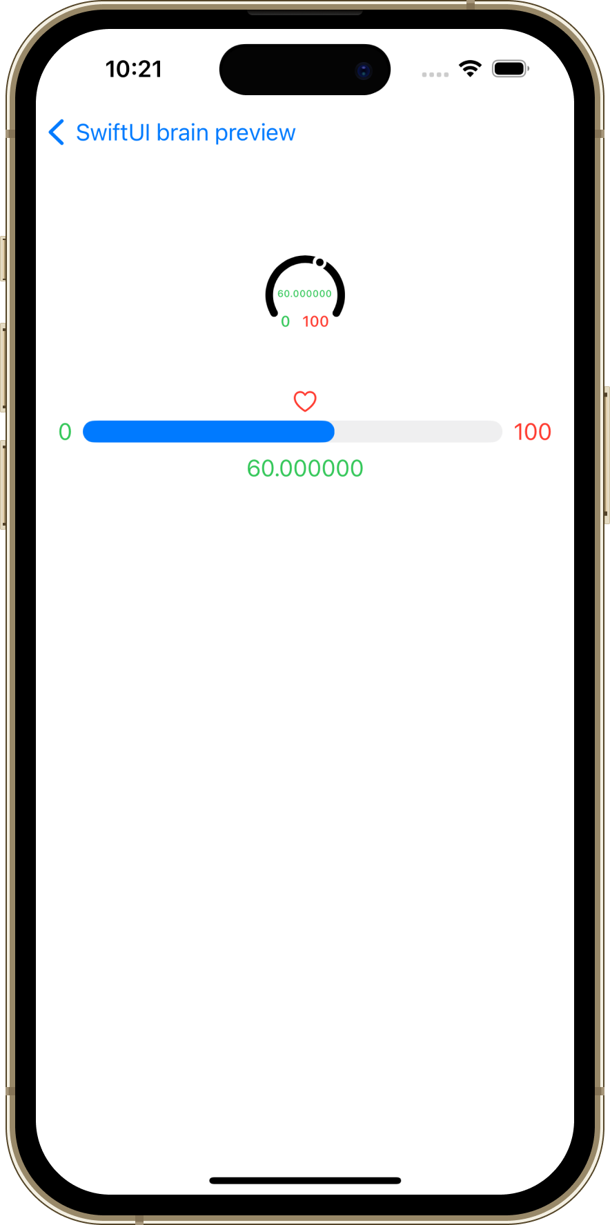
Explanation
This code utilizes SwiftUI’s Gauge view to create a gauge that visually indicates the current value.
Introduced in iOS 16, Gauge is a customizable component available in various styles. It is characterized by its small display size, as it is primarily used on the lock screen.
This example demonstrates two gauge styles—.accessoryCircular and .linearCapacity—each accompanied by labels for minimum, maximum, and current values.
- The
.accessoryCircularstyle creates a circular gauge, typically displayed in a small size. - The
.linearCapacitystyle creates a linear gauge, suitable for showing progress.
The gauge includes labels for the minimum and maximum values, with the current value displayed in green. The label for the minimum value is in green, while the maximum value’s label is in red.
Key Points
- The
Gaugeview is used to visually represent the current value of a number. - The view within the first closure is not displayed, similar to the
Sliderin Question2. .accessoryCircularand.linearCapacityrepresent different styles of theGauge, each providing a distinct visual representation.- The components of the
Gauge(current value label, minimum value label, maximum value label) are customizable, allowing for changes in color and text format. - The format for displaying numbers can vary depending on whether they are converted to integers (which truncates decimals) or displayed as
Double, which includes decimal points.
This explanation focuses on how to use and customize the Gauge view, providing insights into its capabilities and flexibility.
This concludes the introduction and explanation of the SwiftUI Preview Challenge held at the DeNA booth during try! Swift Tokyo 2024. I am delighted that we could offer this experience to many participants. We look forward to contributing to various events in the future. Thank you very much for reading through to the end!


最後まで読んでいただき、ありがとうございます!
この記事をシェアしていただける方はこちらからお願いします。